Multiple Choice
Capture user selections with multiple choice elements for branching, personalization, and data collection.
The multiple choice element presents a set of options for users to select from. It is commonly used in onboarding flows to gather preferences, capture survey responses, or enable branching based on user input.
Adding a multiple choice element
To add a multiple choice element:
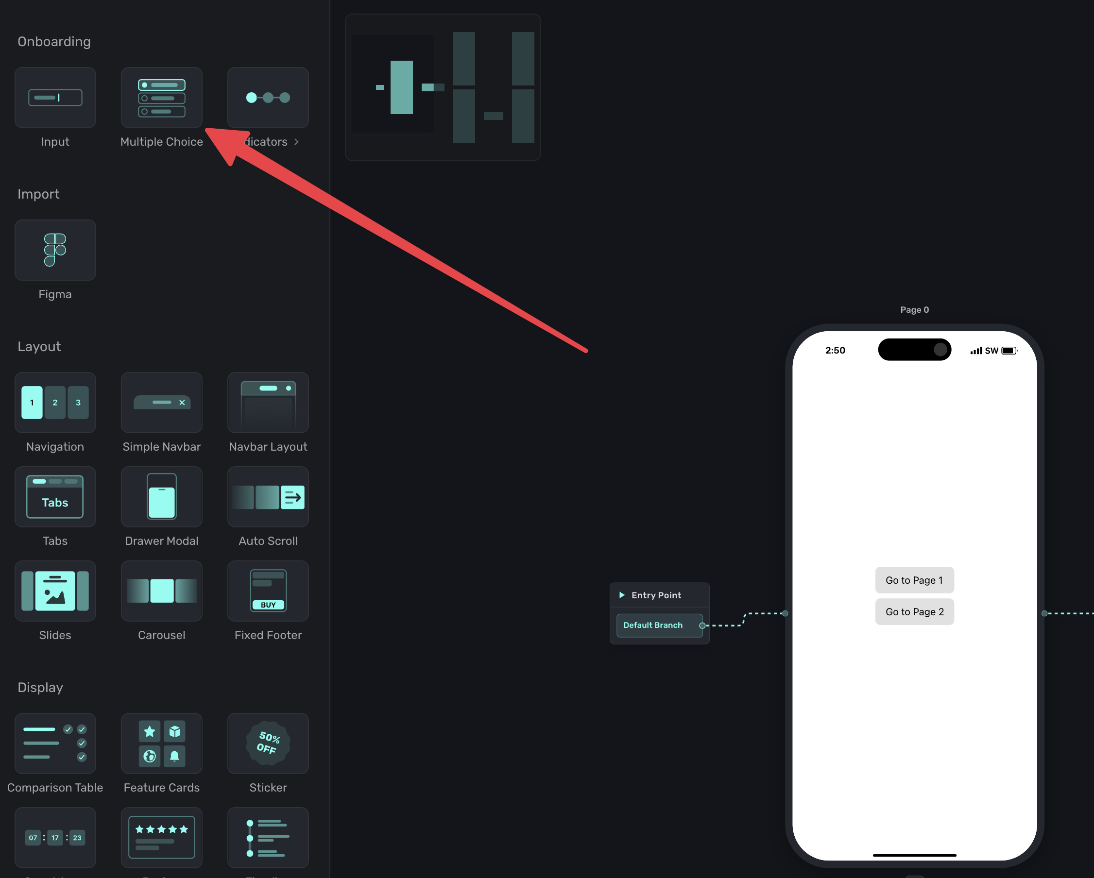
- In the left sidebar, click + to add a new element.
- Choose Multiple Choice under the "Onboarding" header.
A multiple choice component has configuration options to add items, randomize ordering, and more. Select it from the sidebar, and you'll see these options on the right sidebar:

Selection mode
You can configure whether users select one option or multiple:
- Single-select: Users pick one option. The selection replaces any previous choice.
- Multi-select: Users can pick multiple options. All selections are stored.
Randomize order
Enable Randomize order to shuffle the options each time the element appears. This is useful for surveys where you want to reduce selection bias from item ordering.
Items
Each choice has two parts:
- Label: The text users see (e.g., "Grow subscriptions").
- Value: The internal value stored when selected (e.g.,
goal_grow).
Keep values short and consistent. Use lowercase letters and underscores for readability (e.g., preferred_plan, user_goal).
To add more choices, click + Add in the component editor. You can reorder choices by dragging them.
Using selections
Any multiple choice item is available as a variable. You can view variables either from the left side variables menu, or via the floating toolbar. Either case, it's exposed via Element -> Multiple Choice.
Two variables are available for each multiple choice element:
selectedValue: The programmatic value of the selected choice (e.g.,goal_grow). Use this for routing conditions, storing as user attributes, or any logic that depends on a stable internal value.selectedLabel: The display label of the selected choice (e.g., "Grow subscriptions"). This is useful for showing the user's selection back to them in text on a later page. If localization is active,selectedLabelreturns the translated label for the user's locale.
When a user makes a selection, these variables can be used in several ways:
- Routing conditions: Branch the flow based on what the user selected. See branching.
- User attributes: Store the selection as a user attribute for later personalization or analytics.
- Dynamic values: Reference the selection in text elsewhere on the page or in later pages.
Using selections for branching
Multiple choice is the primary way to enable conditional branching in flows. After a user selects an option, you can route them to different pages based on their choice.
For example, if you ask "What is your primary goal?" with options like "Grow subscriptions" and "Reduce churn," you can send each group to a tailored page.
See Linking Pages for detailed branching setup.
Localization
Multiple choice labels can be localized just like text elements. When you add a language in the localization panel, choice labels are included alongside your other translatable strings. This means:
- AI Localize translates choice labels automatically with the rest of your text.
- CSV export/import includes choice labels as rows, so your translation workflow covers them.
- Missing translation filters account for choice labels, so you can spot untranslated options.
- Outdated detection flags choice labels when the base text changes after translation.
When a user makes a selection while localization is active, the selectedLabel variable returns the translated text for their locale.
Multiple choice elements work in both standalone paywalls and multi-page flows. In flows, they unlock branching. In paywalls, they can capture preferences before purchase.
How is this guide?